
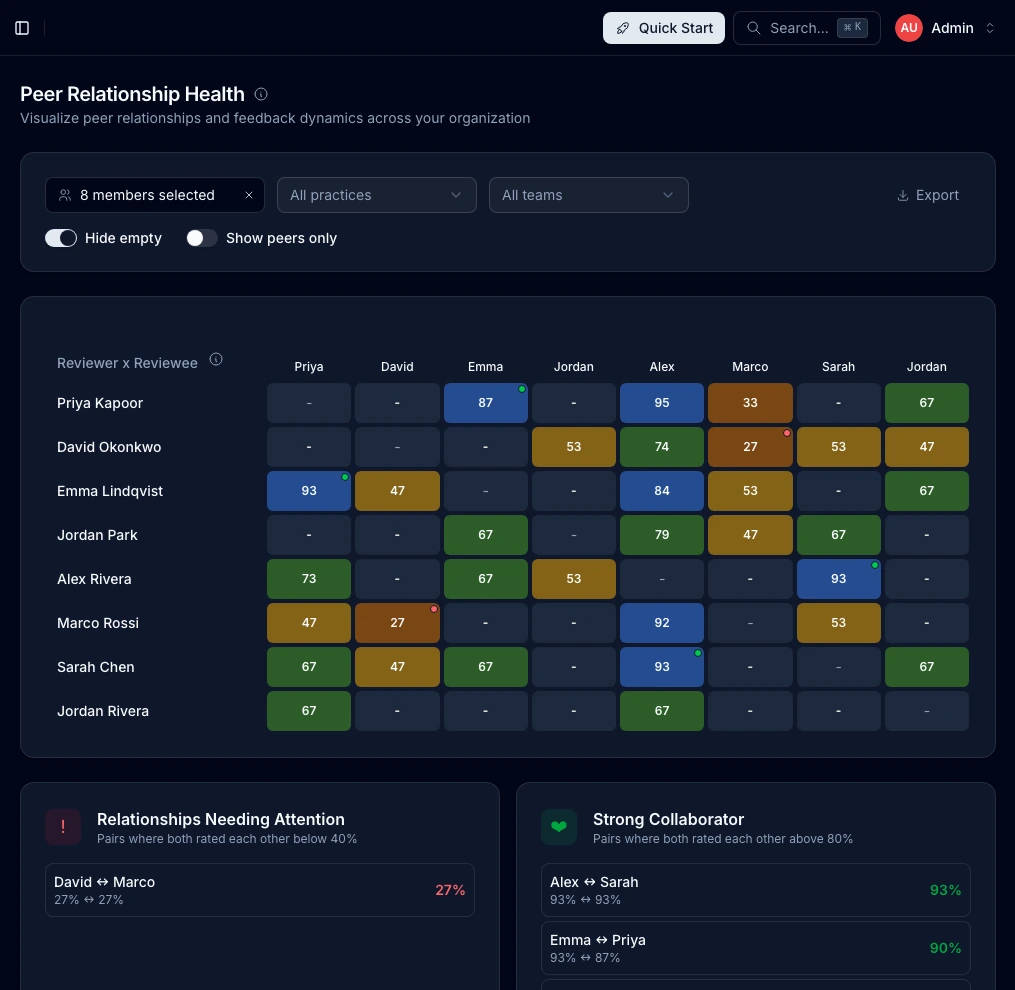
Feedback Matrix
Visualize peer feedback relationships and identify collaboration patterns across your organization.
Last updated
The Feedback Matrix provides a visual representation of feedback relationships across your organization. At a glance, see who is giving feedback to whom and identify both strong collaborations and relationships that may need attention.
How It Works
The matrix displays:
- Rows - Feedback givers (reviewers)
- Columns - Feedback receivers (reviewees)
- Cells - Aggregated feedback score as a percentage (0-100%)
Each cell represents the normalized feedback score from one person to another, calculated from all feedback submissions over time.
Reading the Matrix
Heatmap Colors
Cells use a 5-color heatmap to quickly identify relationship quality:
| Color | Score Range | Meaning |
|---|---|---|
| Red | 0–20% | Significant concerns |
| Orange | 20–40% | Below average, needs attention |
| Yellow | 40–60% | Average, room for improvement |
| Green | 60–80% | Good working relationship |
| Blue | 80–100% | Strong positive feedback |
| Gray | - | No feedback given |
The color progression from red through blue lets you quickly scan the matrix to spot relationships needing focus (warm colors) versus strong collaborations (cool colors).
Cell Interactions
- Hover over any cell to see the exact score and feedback count — a crosshair highlights the entire row and column so you can easily trace who is giving and receiving
- Click on a cell with feedback to open a detail modal showing individual feedback sessions with principle scores and assessment responses
- Self cells (diagonal) show a dash since people don't give feedback to themselves
Relationship Insights
The matrix automatically identifies two types of noteworthy relationships:
Relationships Needing Attention
When two people have both scored each other below 40%, the system flags this as a relationship that may need intervention. These appear in the "Relationships Needing Attention" card below the matrix.
What to do:
- Consider 1:1 conversations with each person
- Explore whether there are work process conflicts
- Evaluate if team restructuring might help
Strong Collaborator
When two people have both scored each other above 80%, this indicates a strong mutual working relationship. These appear in the "Strong Collaborator" card.
What this means:
- These pairs work well together
- Consider pairing them on critical projects
- They may be good mentors for others
Filtering the Matrix
Filter by People
Use the multi-select dropdown to focus on specific individuals:
- Select one or more people to show only their rows and columns
- Enable "Show peers only" to limit the view to people who have exchanged feedback with the selected members
Filter by Practice
If your organization uses practices, filter to see feedback patterns within a specific discipline:
- Useful for practice leads to understand their area
- Helps identify silos or cross-practice collaboration
Filter by Team
Filter to see feedback patterns within a specific team:
- Understand intra-team dynamics
- Compare feedback patterns across teams
Hide Empty
Toggle "Hide empty" to remove rows and columns where no feedback has been exchanged. This simplifies the view when you have many members but sparse feedback data.
Exporting Data
Click Export CSV to download the matrix data:
- Includes all visible members based on current filters
- Contains numeric scores (0-100) or empty cells where no feedback exists
- Useful for further analysis in spreadsheets
Understanding the Scores
How Scores Are Calculated
The matrix score represents a blended, multi-dimension score combining up to five data sources with equal weight:
- Principles — average of principle ratings (1–5 scale), normalized to 0–1
- Your Impact (Q1) — 5-point assessment question, normalized to 0–1
- Team Collaboration (Q2) — 5-point assessment question, normalized to 0–1
- Work Quality (Q3) — 5-point assessment question, normalized to 0–1
- Engagement — latest retention/engagement assessment rating, normalized to 0–1
Only dimensions with available data are included in the average. If insufficient data exists, the score defaults to 0.5 (50%). The final blended score is displayed as a percentage (0–100%).
Score Interpretation
| Score | Typical Interpretation |
|---|---|
| 90-100% | Exceptional working relationship |
| 75-89% | Strong positive collaboration |
| 60-74% | Good working relationship |
| 45-59% | Average, room for improvement |
| 30-44% | Below average, attention recommended |
| 0-29% | Significant concerns |
Limitations
- Scores require sufficient feedback data to be meaningful
- New relationships may show limited data
Best Practices
For Admins
- Review weekly for emerging patterns
- Act on mutual low scores before they escalate
- Celebrate strong collaborations to reinforce positive behavior
- Use filters strategically to focus investigations
For People Managers
People managers can access a limited version of this matrix showing only their direct reports:
- Use it to understand team dynamics
- Identify coaching opportunities
- Spot potential conflicts early
Privacy Considerations
- Individual feedback submissions remain anonymous
- Only aggregated scores are displayed
- Clicking a cell opens a detail modal showing per-session principle breakdowns and assessment responses
- Export data contains only aggregated scores
Related Documentation
- Insights Dashboard - Overview of all admin analytics
- 360 Feedback - How the feedback system works
- Feedback Questions - The questions that generate these scores